Skip to content
This repository was archived by the owner on Dec 11, 2021. It is now read-only.

Needs a UI Guide  #157

@nashvail

Description

@nashvail

Before we start to work on styling components, it'd be good to have a solid UI Document first.
Components to be included in first UI guide (phase one) :

Style Guide (.sketch)

Typography

Types

  • Heading
  • Body
  • Emphasis (Bold/ Italics)
  • Blockquote
  • Addresses
  • Abbreviations

Buttons

Types

  • Default
  • Primary
  • Success
  • Info
  • Warning
  • Danger
  • Block Buttons
  • Button Bars
  • Icon + Text
  • Icon Only

States (See #10 )

  • Normal
  • Hover
  • Focus
  • Disabled
  • Active
  • Readonly

Sizes

  • Extra Small
  • Small
  • Medium
  • Large
  • Extra Large

Progress so far (Open for community feedback)
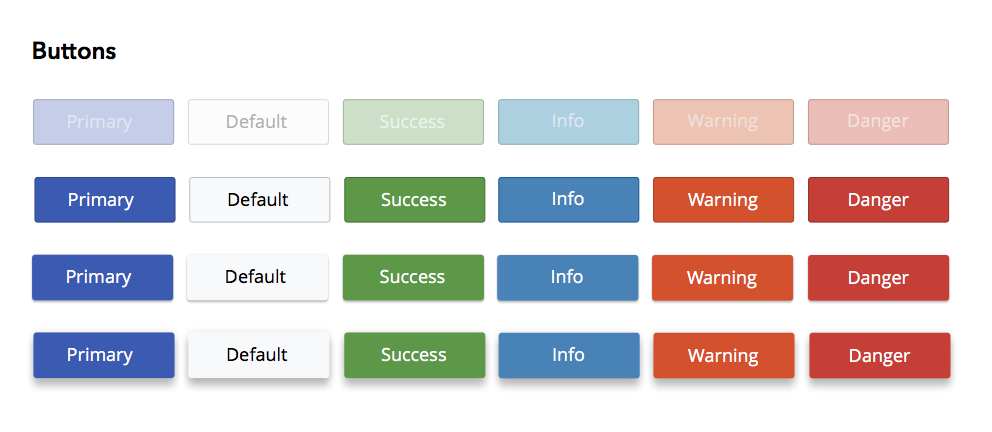
Buttons

Input

Types

HTML4 (See #6)

  • text
  • textarea
  • password
  • checkbox
  • radio
  • submit
  • reset
  • hidden
  • file / Image
  • Select
  • Labels (inline and above input)

HTML5 (See #8)

  • search
  • email
  • url
  • tel
  • number
  • range
  • date
  • month
  • week
  • time
  • datetime
  • datetime-local
  • color

States

  • Normal
  • Focused
  • Disabled
  • Error
  • Disabled
  • Active
  • Readonly

Sizes

  • Emphasized
  • Standard
  • Tiny

Validation Styling (See #9 )

  • Input/Label Styling for Validation
  • Inline Validation Messages
  • Above Form Validation Messaging

Progress so far (Open for community feedback)
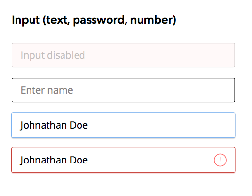
Inputs

Notifications

Types

  • Default
  • Success
  • Info
  • Warning
  • Danger

Table
Images

Metadata

Metadata

Assignees

No one assigned

    Labels

    No labels
    No labels

    Type

    No type
    No fields configured for issues without a type.

    Projects

    No projects

    Milestone

    No milestone

    Relationships

    None yet

    Development

    No branches or pull requests

    Issue actions