Create dynamic, dockable, and resizable layouts with ease, similar to editors like VS Code.


Dynamix Layout is a powerful JavaScript library designed to help you build complex, multi-panel user interfaces. It provides a core engine for managing the layout logic and a dedicated React wrapper for seamless integration into your React applications. If you've ever wanted to create a user experience with draggable tabs and resizable panels, Dynamix Layout is the tool for you.
Made with ❤️ by Akash Aman
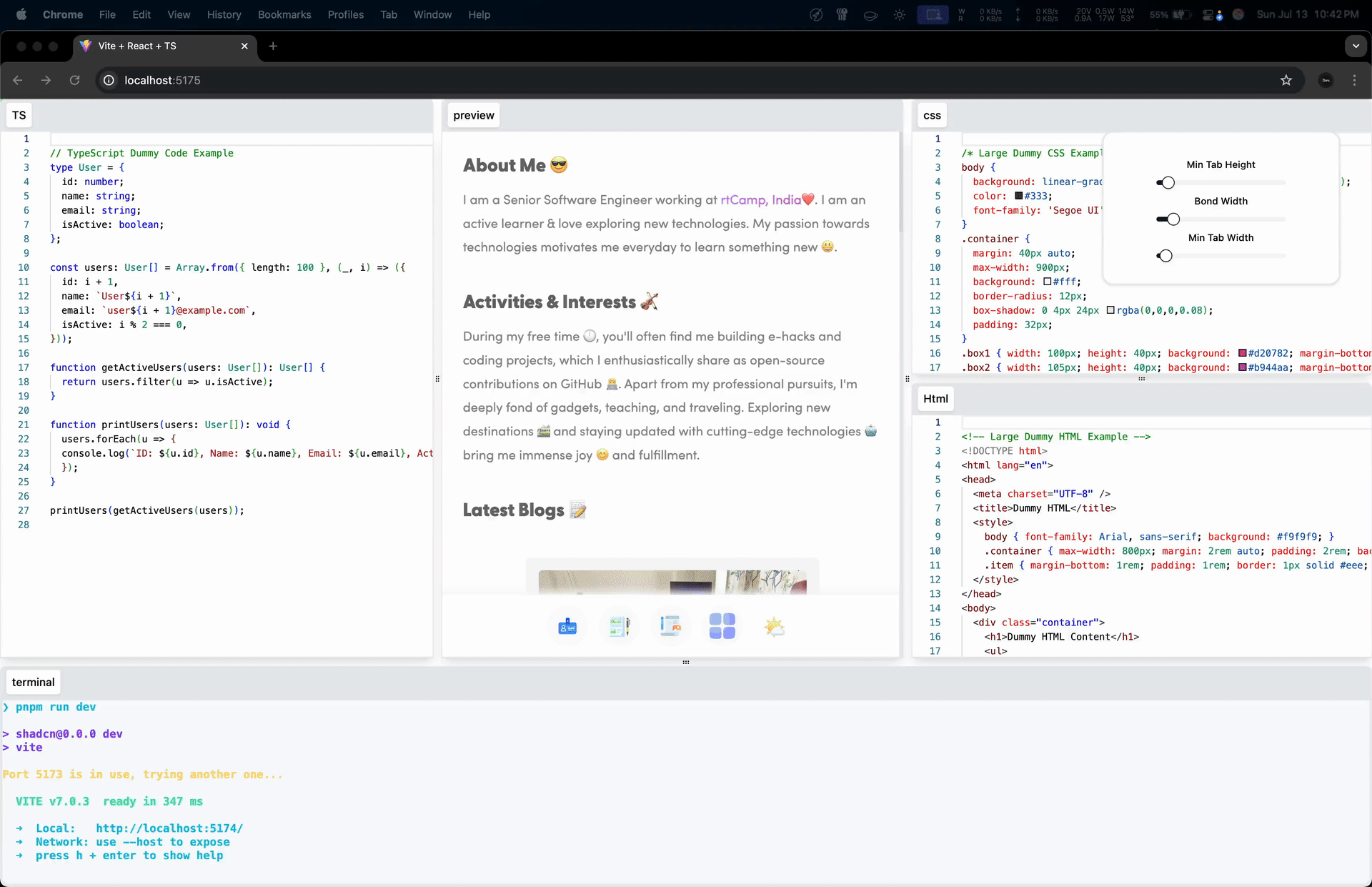
- Draggable Tabs: Easily drag and drop tabs to rearrange them or create new panel splits.
- Resizable Panels: Users can click and drag the space between panels to resize them.
- Dynamic Splits: Split any panel horizontally or vertically by dropping a tab onto its edge.
- Save & Restore: Serialize the entire layout state to JSON and restore it later.
- Framework-Agnostic Core: The core logic is written in pure TypeScript with zero dependencies.
- Official React Wrapper: A feature-rich React component (
<Layout />) and hook (useLayout) for easy integration.
This repository contains the following packages:
The core, framework-agnostic layout engine. It handles all the complex logic of tree management, dimension calculation, and state updates. You can use this package to integrate Dynamix Layout with any framework (Vue, Svelte, Angular, etc.) or with vanilla JavaScript.
➡️ View the detailed @dynamix-layout/core README
The official React component library for Dynamix Layout. It provides a simple-to-use <DynamixLayout /> component and an advanced useDynamixLayout hook that handles all the rendering, state management, and event binding for you. This is the recommended package for all React developers.
➡️ View the detailed @dynamix-layout/react README
The official SolidJS wrapper for @dynamix-layout/core. It provides a flexible <DynamixLayout /> component and an advanced useDynamixLayout hook to create fully dynamic, resizable, and draggable tab-based layouts with ease.
➡️ View the detailed @dynamix-layout/solid README
This repository contains the following examples:
| Example | Source Link | Live Demo Link |
|---|---|---|
| React | React | dx.xcode.cx |
| Next.js | Next.js | nextjs.dx.xcode.cx |
| SolidJS | SolidJS | solidjs.dx.xcode.cx |
| SolidStart | SolidStart | solidstart.dx.xcode.cx |
For React applications, you will need both the react and core packages.
npm install @dynamix-layout/react @dynamix-layout/coreFor Solid applications, you will need both the solid and core packages.
npm install @dynamix-layout/solid @dynamix-layout/coreHere's how easy it is to get started with the React component:
import { DynamixLayout } from '@dynamix-layout/react'
import '@dynamix-layout/react/style.css'

function App() {

	const tabList = [
		['editor', <div style={{ background: '#c0ca33', height: '100%' }}>Editor</div>],
		['preview', <div style={{ background: '#66bb6a', height: '100%' }}>Preview</div>],
		['terminal', <div style={{ background: '#ffc400', height: '100%' }}>Terminal</div>],
	]

	return (
		<DynamixLayout tabs={tabList} style={{ height: '100vh', width: '100vw' }} />
	)
}

export default App
Here's how easy it is to get started with the SolidJS component:
import { DynamixLayout } from '@dynamix-layout/solid'
import '@dynamix-layout/solid/style.css'

function App() {

	const tabList = [
		['editor', <div style={{ background: '#c0ca33', height: '100%' }}>Editor</div>],
		['preview', <div style={{ background: '#66bb6a', height: '100%' }}>Preview</div>],
		['terminal', <div style={{ background: '#ffc400', height: '100%' }}>Terminal</div>],
	];

	return (
		<DynamixLayout tabs={tabList} style={{ height: '100vh', width: '100vw' }} />
	)
}

export default AppContributions, issues, and feature requests are welcome! Feel free to check the issues page.
This project is MIT licensed.