


ScrollView, FlatList, SectionList with collapsible headers + HOC for wrapping custom scrollables
$ npm install react-native-collapsible-header-views --save
| Android | iOS |
|---|---|
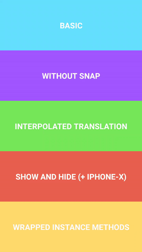 |
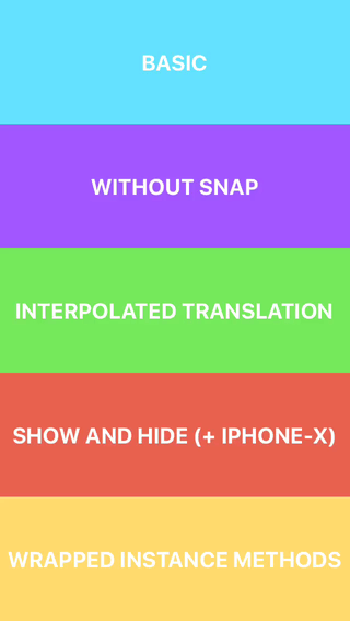 |
import * as React from 'react';
import { View, Platform } from 'react-native';
import { CollapsibleHeaderScrollView } from 'react-native-collapsible-header-views';

export const Basic = () => (
  <CollapsibleHeaderScrollView
    CollapsibleHeaderComponent={<View style={{ backgroundColor: 'white' }} />}
    headerHeight={100}
    statusBarHeight={Platform.OS === 'ios' ? 20 : 0}
  >
    <View style={{ height: 2000, backgroundColor: 'wheat' }} />
  </CollapsibleHeaderScrollView>
);Library exports three components CollapsibleHeaderScrollView, CollapsibleHeaderFlatList,
CollapsibleHeaderSectionList and a HOC withCollapsibleHeader for wrapping custom scrollable
components. Provided components support all props and instance methods of corresponding wrapped
components. Note that components are also wrapped with Animated.createAnimatedComponent under the
hood.
CollapsibleHeaderComponent: React.ReactElement<unknown> | React.ComponentType<CollapsibleHeaderProps>- React element or component/function that receivesCollapsibleHeaderPropsobject. Required;headerHeight: number- height ofCollapsibleHeaderComponent. Required;statusBarHeight?: number- height of status bar. Defaults to0;headerContainerBackgroundColor?: string- background color forCollapsibleHeaderComponentand status bar container. Defaults to'white';disableHeaderSnap?: boolean- passtrueto disable header snap animations. Defaults tofalse;headerAnimationDuration?: number- duration of snap andshowHeader,hideHeaderanimations. Defaults to350;clipHeader?: boolean- iftrueheader will be clipped withoverflow: 'hidden'style.
Also some of ScrollView props have new defaults: bounces defaults to false, overScrollMode
to 'never' and scrollEventThrottle to 1.
interpolatedHeaderTranslation: (from: number, to: number) => Animated.AnimatedInterpolation- creates newAnimatedInterpolationobject, whose input range corresponds to header translation and output range is specified byfromandtoparams. Can be used for custom animations, like setting opacity etc.;showHeader: (options: { animated: boolean } | unknown) => void- pushes header down with animation enabled by default;hideHeader: (options: { animated: boolean } | unknown) => void- pulls header up with animation enabled by default.
animatedComponent: () => any | null- returns result ofAnimated.createAnimatedComponentapplied to original component;showHeader: (options: { animated: boolean } | unknown) => void- pushes header down with animation enabled by default;hideHeader: (options: { animated: boolean } | unknown) => void- pulls header up with animation enabled by default.
function withCollapsibleHeader<T extends ScrollViewProps>(Component: React.ComponentClass<T>): React.ComponentClass<CollapsibleHeaderViewProps<T>>- creates new component with collapsible header, it is assumed that input component has all ofScrollViewprops.
- Key concepts were taken from collapsible-navbar demo by @janicduplessis